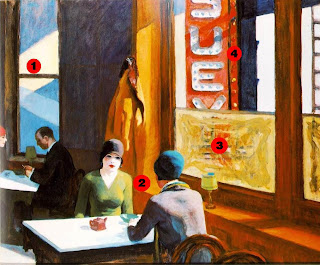
“I escape the drudgery of city life to engage in another, disconnected world of conversation with an associate.”
Notes and Interpretation of Chop Suey

- “Strong shafts of light – both natural and artificial – create a dazzling arrangement of colourful geometric forms.”[i]
a) The artificial nature of city life – artificial lights during day time; sensory stimulation. - According to some art scholars, one "striking detail of Chop Suey is that its female subject faces her doppelgänger."[ii] Doppelgänger (meaning): is the ghostly double of a living person[iii].
a) Allows a place for self-reflection, one’s own time.
b) No external distractions, patrons are fully engaged with each other.
i) Perhaps not a good thing, looking disinterested. - Windows are obstructed, and solely used for lighting.
a) No external distractions, patrons are fully engaged with each other.
i) Perhaps not a good thing, looking disinterested.
b) Disconnection from the city.
c) Natural sunlight is quite harsh compared to the pale skin tones – further indicating a disconnection from the exterior world (untanned and sickly looking faces). Maybe due to it being winter (indicated by the coat hung on the wall).
d) Interior is clearly defined.
e) City is characterless. - Constant bombardment of advertising material, and sensory stimulation in the form of bright colourful lights, versus the nondescript nature of the restaurant. “The browns and earth-tones of their [patrons] garments are in stark contrast to the garish red sign outside the window announcing the name of the restaurant.”[iv]
a) “Its presence also indicates this is a second-floor walk-up establishment”[v]
References
(will tidy up later)
[i] http://www.nga.gov/exhibitions/2007/hopper/acloserlook.shtm
[ii] Anfam, David: "Edward Hopper.", page 39. Tate Publishing, 2004.
[iii] http://en.wikipedia.org/wiki/Doppelg%C3%A4nger
[iv] http://www.alledwardhopper.com/category/urban/page/2
[v] http://www.nga.gov/exhibitions/2007/hopper/acloserlook.shtm
- Hopper's favoured subject matter - the common features of American life
- The use of light and shadow to create mood
- Commentary on American urban scene
The 'Language' of My Building's Architecture
- Site - inner city, run down (possibly industrial) - escape the torments of city life.
- Openings like that of a sanatorium/prison, limited, not used for viewing out. Harshly contrasts with the now common 'glass box' (office buildings).
- The building's purpose is for patrons to look in, not out.
- Modern condition of distraction, limited attention spans, impulsive stimulations.
- Building as an urban retreat allowing for real engagement.


No comments:
Post a Comment