- a close walk from the hustle and bustle of the city centre, say for example Surry Hills from Sydney
- small block
- perhaps in between row houses
- two storeys high
Monday, April 27, 2009
Siting
Idea Development (Brainstorming)
“I escape the drudgery of city life to engage in another, disconnected world of conversation with an associate.”
What level of engagement?
What associate?
Three general classes (in order of increasing engagement):
- Group of close friends
- Couple
- Oneself
SOLUTION: design three different rooms which cater to the above three levels of engagement. Architecture will respond to this:
Group of close friends:
- open plan
- kitchen facilities
- lounge
A couple:
- nestled
- courtyard garden
One's own self:
- removed (allows for contemplative thinking)
- isolated
- no windows, natural lighting through roof
- located higher, higher is more secluded - access via stairs (ladder)
- [small windows are one way mirrors (mirror facing inside) not so that others can see in, but so that patrons who are looking out for answers are pressed to look inwards for the answers they seek]
The building will operate on a self check-in basis. Patrons can choose to use whichever room best suits their requirements. External openings will be limited throughout to emphasise the disconnection. Increasing engagement means smaller room sizes.
NOT SURE WHETHER TO USE THIS METHOD (CATERING TO THREE DIFFERENT CLASSES), OR PERHAPS SPECIALISE THE ENTIRE BUILDING TO CATER TO ONE CLASS? ANU??
Building Typology
The related case study was also very interesting and had common ideas to my building. Some notes on the Box Home:
- “peaceful”
- “small”
- “urban cave”
- exterior – unassuming
- opening types
- few windows
- material usage – varied, “internally, a different species of wood was chosen for each room”. The effect these timber rooms have.
- size – “19 square metre dwelling with four rooms covering the basic living functions”
- use of a ladder - possible use in secluded room


Monday, April 13, 2009
PROJECT 2: ROOM AND NARRATIVE - Musings
“I escape the drudgery of city life to engage in another, disconnected world of conversation with an associate.”
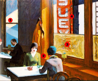
Notes and Interpretation of Chop Suey

- “Strong shafts of light – both natural and artificial – create a dazzling arrangement of colourful geometric forms.”[i]
a) The artificial nature of city life – artificial lights during day time; sensory stimulation. - According to some art scholars, one "striking detail of Chop Suey is that its female subject faces her doppelgänger."[ii] Doppelgänger (meaning): is the ghostly double of a living person[iii].
a) Allows a place for self-reflection, one’s own time.
b) No external distractions, patrons are fully engaged with each other.
i) Perhaps not a good thing, looking disinterested. - Windows are obstructed, and solely used for lighting.
a) No external distractions, patrons are fully engaged with each other.
i) Perhaps not a good thing, looking disinterested.
b) Disconnection from the city.
c) Natural sunlight is quite harsh compared to the pale skin tones – further indicating a disconnection from the exterior world (untanned and sickly looking faces). Maybe due to it being winter (indicated by the coat hung on the wall).
d) Interior is clearly defined.
e) City is characterless. - Constant bombardment of advertising material, and sensory stimulation in the form of bright colourful lights, versus the nondescript nature of the restaurant. “The browns and earth-tones of their [patrons] garments are in stark contrast to the garish red sign outside the window announcing the name of the restaurant.”[iv]
a) “Its presence also indicates this is a second-floor walk-up establishment”[v]
References
(will tidy up later)
[i] http://www.nga.gov/exhibitions/2007/hopper/acloserlook.shtm
[ii] Anfam, David: "Edward Hopper.", page 39. Tate Publishing, 2004.
[iii] http://en.wikipedia.org/wiki/Doppelg%C3%A4nger
[iv] http://www.alledwardhopper.com/category/urban/page/2
[v] http://www.nga.gov/exhibitions/2007/hopper/acloserlook.shtm
- Hopper's favoured subject matter - the common features of American life
- The use of light and shadow to create mood
- Commentary on American urban scene
The 'Language' of My Building's Architecture
- Site - inner city, run down (possibly industrial) - escape the torments of city life.
- Openings like that of a sanatorium/prison, limited, not used for viewing out. Harshly contrasts with the now common 'glass box' (office buildings).
- The building's purpose is for patrons to look in, not out.
- Modern condition of distraction, limited attention spans, impulsive stimulations.
- Building as an urban retreat allowing for real engagement.
Tuesday, April 7, 2009
Project 1: Artifice - Model


- highlighted the interior and exterior spaces (enclosure parti)
- was parallel to the axis facing the ocean, what Utzon wanted to take advantage of, thereby emphasising the minimal structure on one side compared to the other (structure parti)
- clearly indicated the central public core, and private wings (program parti)
The structural "ribs" of the model can be seen below the floor level. A series of these were cut with varying levels to accommodate for the varying floor levels of the Villa. Some of the supports were biscuited together to account for, for example, the different floor levels on either side of a wall. Utzon alters the floor and roof levels to emulate the surrounding steeped/terraced landscape.
Friday, April 3, 2009
ARCH1201 PROJECT 1: ARTIFICE - Drawings

[1] Richard Weston, Utzon: Inspiration, Vision, Architecture, (Denmark: Blondal Publishing, 2002), 390.
Program
 The Villa matches closest to the 'row house' program with main corridors throughout the house giving access to all rooms.
Circulation
 Around four main corridors allow access to all the Villa's rooms.
Structure
 Structure: any supporting object carrying more than it's self-load.
Can Feliz is a 'machine for viewing'[1]. Lighter structural elements are used at the back of the building to minimise their visual obstruction of the sea views.
[1] Richard Weston, Utzon: Inspiration, Vision, Architecture, (Denmark: Blondal Publishing, 2002), 389.
Geometry

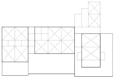
Distances are commonly found in multiples of three metres, creating simple square and rectangular patterns.


